
Ciceksepeti Cactus Design System
Overview
My Role
Product Designer
Year
Jun 1, 2022
Tools
Figma, Google Suite, Jira
Client
Project Intro
With the design system we established to gather stakeholders at a single point, the Cactus Design System, with which we can proceed from a single design line and achieve good results in terms of accessibility and user experience, is actively used.
What Was The Problem
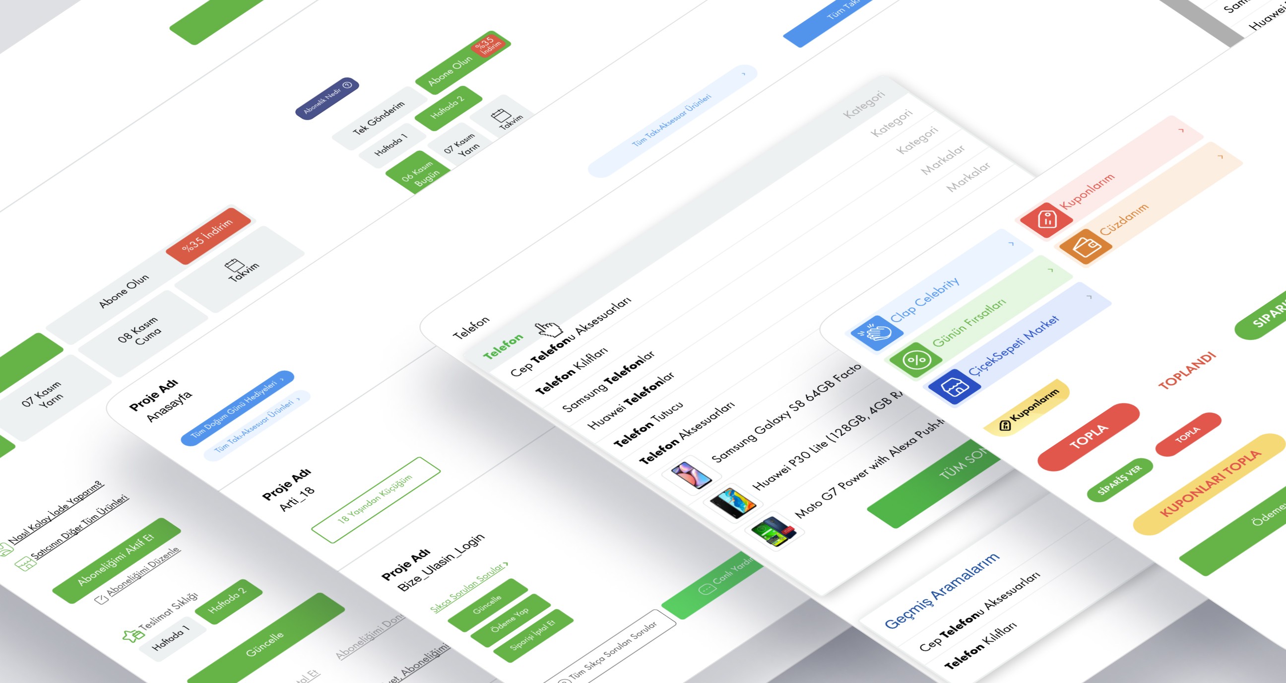
Ensuring synchronization between products and teams is a pain point for large companies. Çiçeksepetinde did not have a design language before, as it did not have a design team, and it had a very limited design library, but it could not go beyond saving the day. In addition, it was also affecting the working process of the engineering teams in a very bad way. Design-Software processes were taking longer and progressing incorrectly.
Our Solution Process
Due to the expanding product range and to solve the problems mentioned above, we needed a system that was larger, more comprehensive and more consistent than the design library.
Explorations & Research
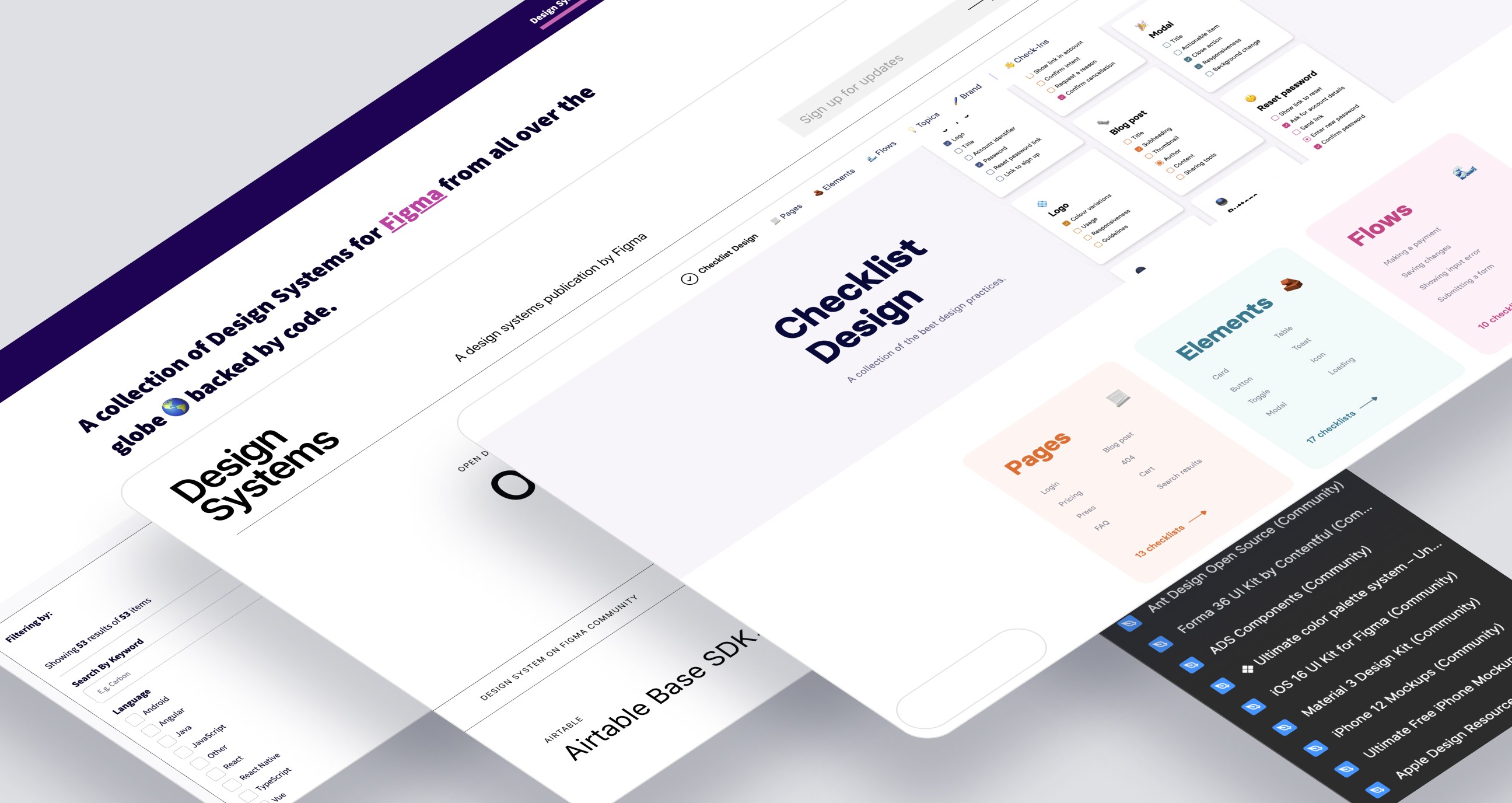
First of all, we examined the components in existing designs. Each page had different colors and styles of components. We examined the design systems of large companies with all the variations of the components. We discussed/evaluated the problems they experienced and the solutions they produced as a team within the scope of the design system.
UI Audit
In order to preserve the design language among our products, we shared and inspected all the components in our library one by one. As a result of this audit, we identified the problems in our current library. What are these problems?
Incompatibility of our colors and non-compliance with accessibility standards (WCAG),
Each component has a different style and does not have a specific standard (radius, borders, padding, etc.),
Lack of a specific grid structure (micro-padding and macro-padding errors),
Lack of interaction and errors
Problematic clickable/touchable areas in components,
Our font family is not large and is not available in the Google Font library.
Team building
While making the design system, the key point was that everyone in the team contributed and worked in coordination with other teams. Together with the Product Managers, we evaluated how the process would progress and whether there were sufficient resources in the meetings we held with the Engineer team. We have determined a road map to use the resources we have in the most efficient way. We researched together, talked, discussed and most importantly, we agreed on a common point.
During the process of creating the design system, we tried to maintain synchronization by holding constant meetings with other teams.
Our Solutions
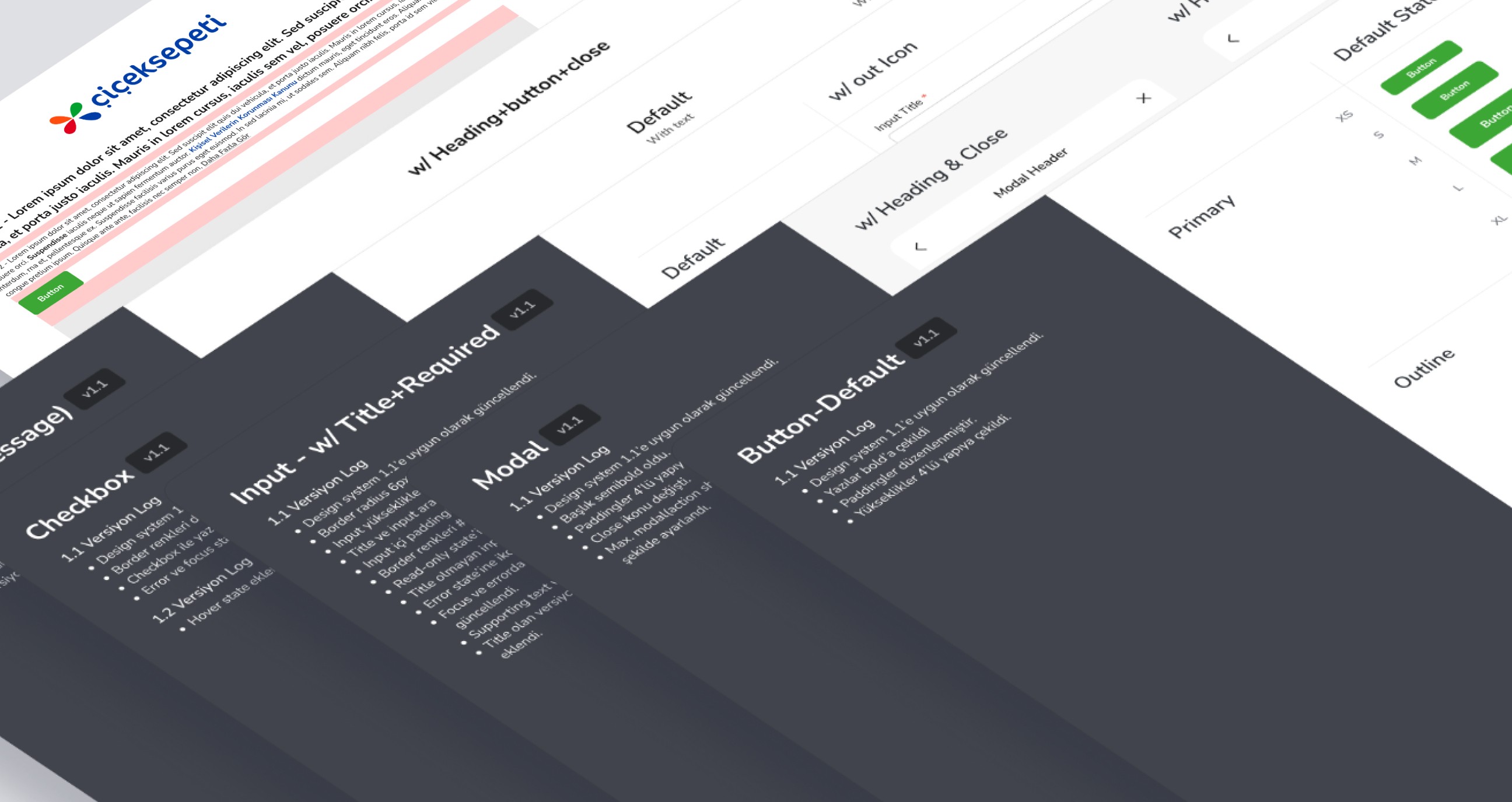
First of all, we made our color library compatible with accessibility standards. We also have colorblind friends in our team, and at this point we closely observed their accessibility problems. We took action to prevent this. We tried to maximize accessibility by controlling the contrast values of the colors. We checked for sufficient contrast between background and text elements according to WCAG Color Contrast guidelines. We have appropriately revised many of the colors that did not pass the test. Colors; We divided it into 5 main groups: Primary Colors, Secondary Colors, Semantic Colors, Neutral Colors and Supportive Colors. We then decided which colors to choose for these categories. The key here was to make the arrangements while preserving the brand identity as much as possible.
We can determine the importance of the texts in the design by using the size of the font family we use and other weights of the font. Even increasing or decreasing the size of a font by 1pt can have a visible impact on your sales. We determined our new font as Nunito, which is a Google font. We chose this font family because it fits the general design language of the site, supports other languages and has more than one font weight. We mostly use Regular, Semibold and Bold weight types from this family. In this way, we clearly ensure the hierarchy in the design.
In order to clearly see the mathematical ratios between design and software and to put the designs into proportion, we applied the "8px grid" system, which is the most used and most easily adapted to responsive.
Implementation & Dev
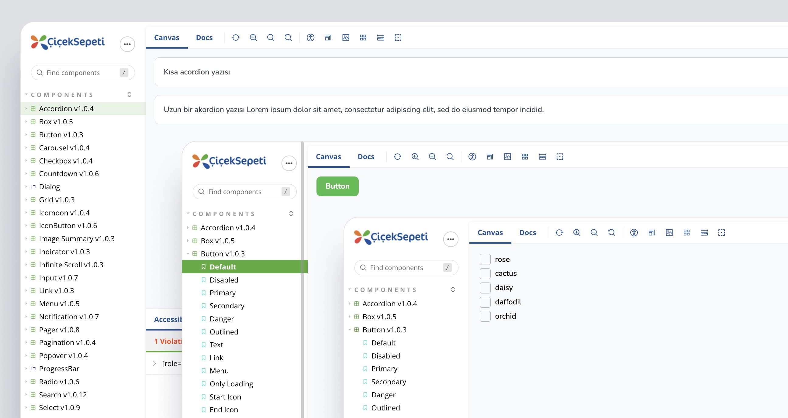
We shared the Cactus design system we created with the Front-end team. They transferred all the components to the storybook. They then sent us the link of the library they created for us to review, and we performed our component-by-component checks in a pixel perfect manner on this link. We communicated our findings to the software and testing team via Google Docs. Later, the relevant teams fixed the errors found.
Reflections
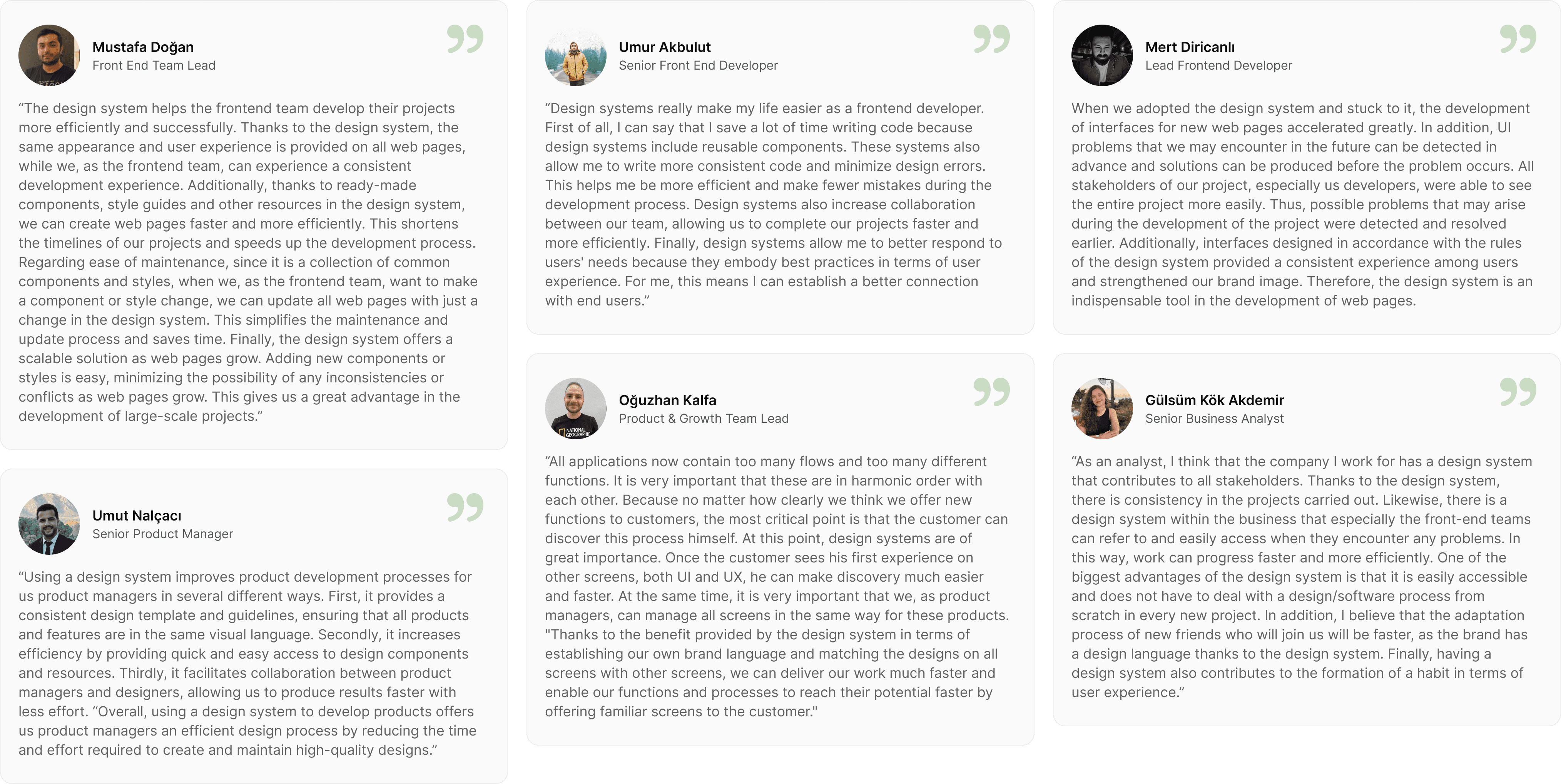
How was the Design System we created interpreted by other teams?
